Welcome to my portfolio page for small projects!
Here I present a selection of small but significant projects that I have implemented for individual customers. From flyers to business cards to other materials, each project is designed with dedication and care to meet my clients' individual needs and desires.
Each project tells its own story and shows my versatility in the design and implementation of different print materials. Whether it is promoting a local event, creating a professional look for a small business owner, or creating personalized cards for special occasions, I have approached each project with passion and creativity.
I invite you to take a look at these small projects and get inspired. You might find something that speaks to you or provides ideas for your own future projects.
Thank you for your interest in my work!

Für meine Projektvorstellung möchte ich Ihnen die neue Speisekarte vorstellen, die ich für meinen Kunden Ti,amo Pizzeria entworfen habe. Die Karte besticht durch einen modernen Look, der die Eleganz der Pizzeria widerspiegelt. Bei der Gestaltung habe ich Farben wie Schwarz, Blau und Marmorweiß verwendet, die in ihrer Kombination eine harmonische und stilvolle Optik schaffen.
Besonders wichtig war es, auf die Wünsche des Kunden einzugehen und die Speisekarte klar und übersichtlich zu gestalten. Jede Speise wurde so platziert, dass sie leicht zu finden ist, was eine angenehme Benutzererfahrung gewährleistet. Dezente Design-Elemente und kleine Akzente verleihen der Karte das gewisse Etwas und runden das Gesamtbild ab.
Um die Gerichte noch ansprechender zu präsentieren, habe ich kleine Bilder ausgewählter Speisen eingefügt. Diese visuelle Unterstützung soll die Gäste inspirieren und ihre Vorfreude auf das Essen wecken. Insgesamt ist so eine Speisekarte entstanden, die nicht nur funktional ist, sondern auch ästhetisch überzeugt und die Atmosphäre von Ti,amo Pizzeria unterstreicht.
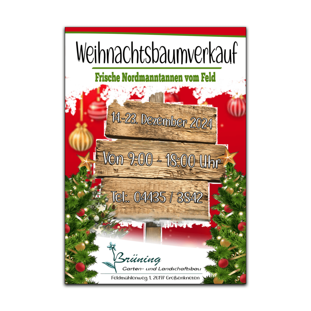
Weihnachtlicher Flyer für Brüning Garten- und Landschaftsbau
Für mein aktuelles Projekt habe ich einen festlichen Flyer für die Firma Brüning Garten- und Landschaftsbau gestaltet. Der Flyer steht ganz im Zeichen der Weihnachtszeit und verbindet den klassischen Weihnachtsstil mit der grünen Welt des Landschaftsbaus. Die Gestaltung ist in den traditionellen Weihnachtsfarben Rot, Weiß und Grün gehalten, was für eine warme und einladende Atmosphäre sorgt.
Die Arbeit an diesem Projekt hat mir viel Freude bereitet, da ich nicht nur meine Kreativität einsetzen konnte, sondern auch die Möglichkeit hatte, das Unternehmen Brüning in einem festlichen Licht zu präsentieren.
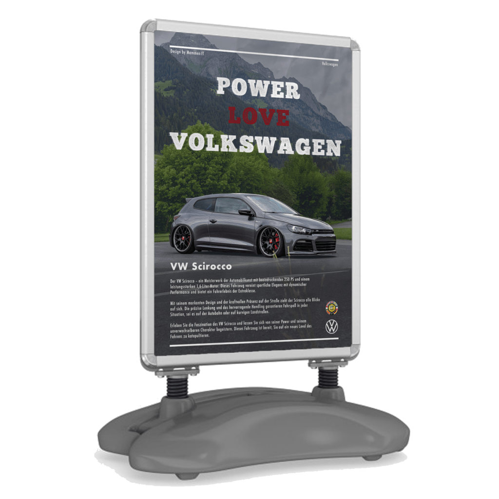
Here I present a special fun project of mine. As a passionate VW Scirocco fan, it was a pleasure for me to create an advertising poster for this iconic car. The poster's design combines typical street style with modern elements to perfectly capture the dynamic and timeless aesthetic of the Scirocco.
The color palette has been carefully coordinated to highlight the striking lines and character of the vehicle. The car is shown in an impressive perspective and has been processed with an oil painting filter to give the image an artistic touch.
I hope you like the result as much as I do and gives a little insight into my passion for the VW Scirocco and graphic design.
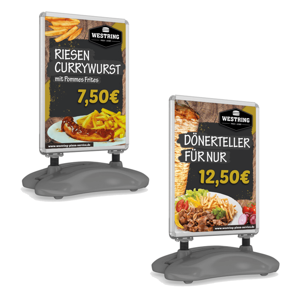
Recently, I completed an exciting new project: designing an A0-sized advertising stand for Westring Pizza Service, a well-known eatery in the industrial area. The client wanted aesthetically pleasing and enticing representations of their specialties, the giant currywurst and the doner plate.
I chose a modern rustic style that perfectly highlights the hearty and authentic qualities of these dishes. The warm colors and natural textures of the design reflect the cozy atmosphere of the restaurant and invite passersby to try the delicious offerings. Every detail, from the juicy meat pieces to the crispy fries, was carefully arranged to stimulate appetite and visually preview the culinary experience.
I'm particularly proud of the balance between modernity and rustic charm: elegant typography meets rustic wooden elements, emphasizing the traditional appeal of the food. This project has shown me how powerful design can be in the culinary world, as it not only whets the appetite but also tells stories and evokes emotions.
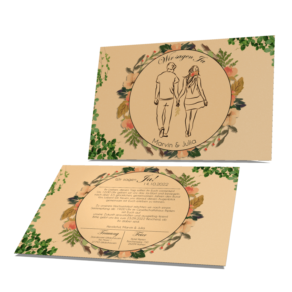
A highlight of my previous projects is a modern wedding invitation in A5 landscape format. This invitation was designed with a sand-colored background and green plant elements to convey an atmosphere of naturalness and freshness. Both the drawing and the texts were personally created by me to give a unique and individual touch.
This wedding invitation is an example of my ability to develop creative concepts and translate them into attractive designs. With attention to detail and a sense of aesthetics, I designed this invitation to represent my clients' special event in a unique way.
I take pride in helping my clients create unique and personal wedding invitations. If you would like to find out more about my work or are interested in collaborating, I would be happy to help you.
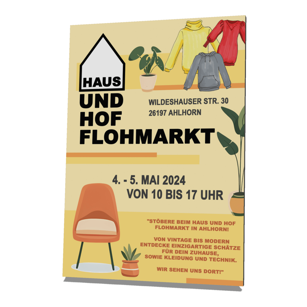
An example of my creative work is designing a flyer for a home and yard flea market. Designed in modern colors, this flyer features a lightweight pop-up style that immediately grabs viewers' attention. The fonts were carefully selected and perfectly coordinated to achieve a harmonious overall effect.
The highlight of the flyer is the comic-style images of furniture, clothing and plants, which give the design a playful and inviting touch. Each element has been designed with attention to detail to convey the sense of community and discovery associated with a home and yard flea market.
This project showcases my ability to develop creative concepts and translate them into attractive designs. I am proud to be part of such inspiring projects and look forward to sharing more examples of my work with you.
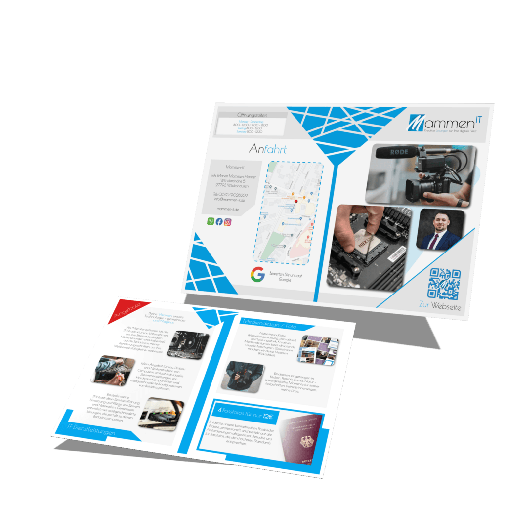
Well, what can I say? There has to be a little self-promotion sometimes. Here is my own flyer for the company Mammen-IT - another example of my creative work that I don't want to withhold from you.
This flyer is also modern and has of course been adapted to the company's colors (blue and white). On the inside of the burglary fold flyer you will find our company's main services, clearly presented to give potential customers a quick overview.
I used my own photos for the external design to give the flyer a personal touch. I also included a business portrait of myself to convey confidence and professionalism.
This project is not only an example of my graphic design skills, but also a testament to my commitment to displaying and marketing my own brand. I'm proud to have created this flyer and look forward to sharing more examples of my work with you.
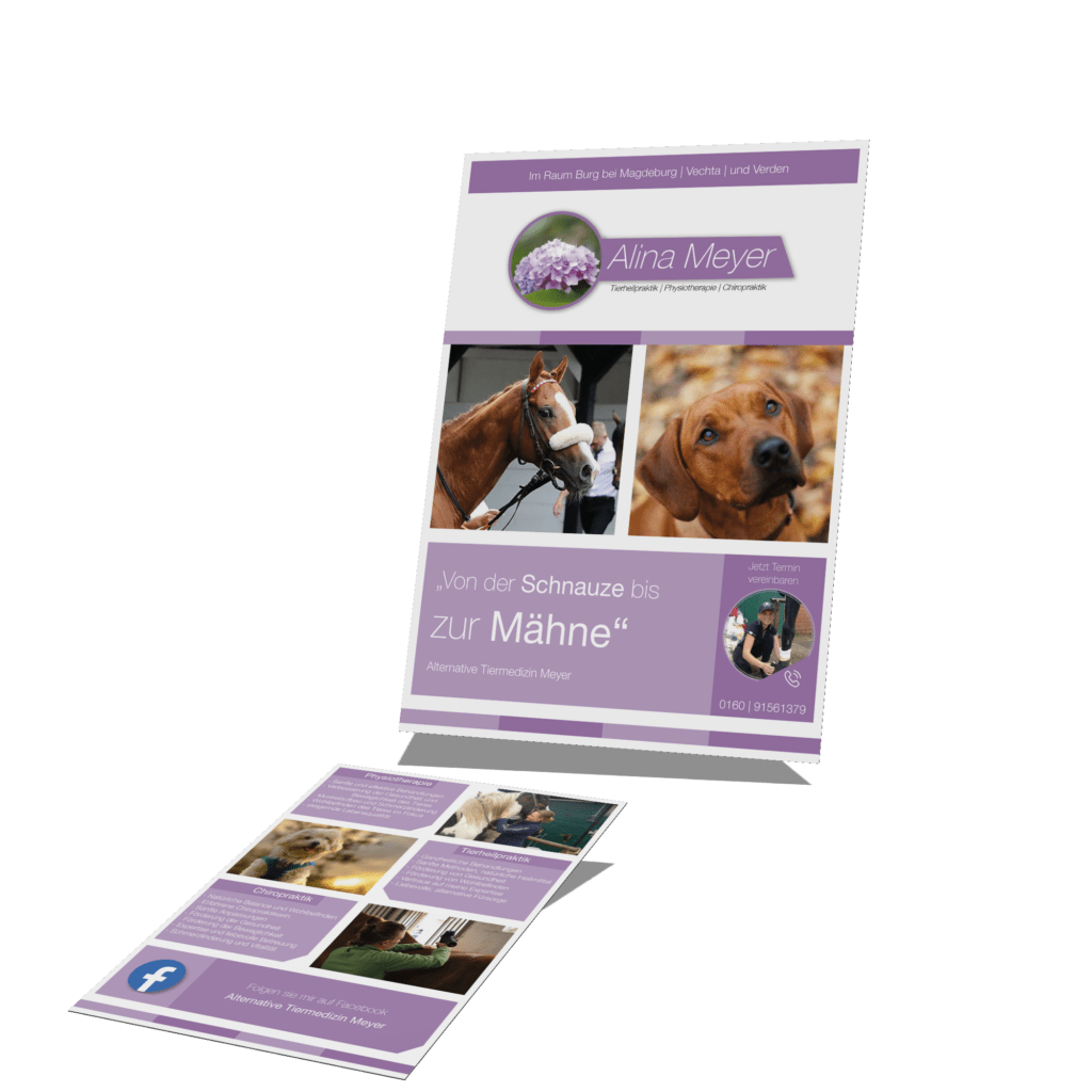
Another project I like to present is the flyer I created for Alina Meyer and her small business.
The flyer was designed in the company colors and with the logo in white, pink and purple to consistently represent Alina Meyer's brand. The key information about their activities was recorded on the back of the flyer to give potential customers a clear overview.
The images used in the flyer are a selection from Alina Meyer herself and were perfectly integrated into the design. The flyer is designed in a modern tile look, which gives the overall appearance a contemporary and appealing aesthetic.
This project demonstrates not only my graphic design skills, but also my commitment to understanding and implementing my clients' individual needs and desires.
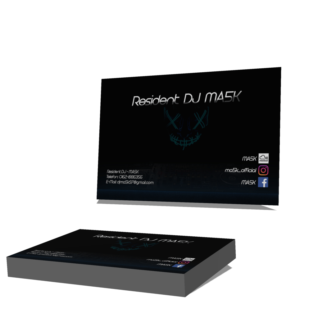
An older project of mine that I would still like to present is the design of a business card from 2021. Even if the customer is no longer active, I would still like to introduce this work to you.
The customer commissioned me to create simple, yet eye-catching business cards. I chose to put his trademark mask in the center of the business card and have it surrounded by a dark blue and black background. This effectively highlighted the client's brand while keeping important information clearly visible.
Although this project was some time ago, it still demonstrates my ability to develop creative and appealing designs that meet my clients' needs and desires. I am proud to have been part of this project and look forward to sharing more work from my portfolio with you.
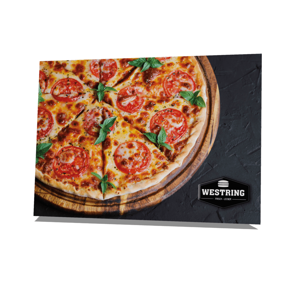
Another project I'm excited to showcase is the aesthetically pleasing promotional image I designed for Westring Pizza Service.
The challenge was to create an image that showcased Westring Pizza Service's delicious pizzas in their best light while also drawing the attention of potential customers to the storefront.
Given the surroundings, which are characterized by a black slate, I chose a composition that focuses on the pizza as a central element and is contrasted by warm, inviting colors. The goal was to create an atmosphere that would awaken the desire for a delicious pizza while highlighting the welcoming ambience of Westring Pizza Service.
This project showcases my ability to develop creative concepts and translate them into aesthetically pleasing images. I am proud to have been part of this project and look forward to sharing more work from my portfolio with you.

An outstanding project that I would like to present is the logo that I designed for the Whitsun club “Best Friends”.
In close consultation with the customer, I created the design exactly according to the club's wishes. It was particularly important to the customer that the name and the year it was founded were in the foreground. That's why I placed the name "Best Friends" above the logo, flanked by two clinking beer glasses, and below the year of founding "Since 2011".
The color palette, consisting of white, yellow and black, has been carefully chosen to reflect the energy and happiness of the club. The logo itself was designed in a comic book style to create a playful and inviting atmosphere.
As a special detail, I placed the Pentecost bird at the top right of the logo to give the design a unique touch while honoring the tradition of Pentecost.
This project is an example of my ability to understand my clients' visions and translate them into creative designs. I am proud to have been part of this project and look forward to sharing more work from my portfolio with you.
Combines creativity with IT excellence for your digital future. We design innovative solutions that exceed your requirements.
© Mammen-IT 2020 - 2024 | All Rights Reserved.